
Red Hat Training
A Red Hat training course is available for Red Hat JBoss Operations Network
9. Reports and Data
Monitoring information in JBoss ON is easy to find. Resources and groups both have dashboards which contain snapshot views of the most recent metrics values and a series of graphs and tables which break down the different metrics values over a given time window.
Monitoring information is available in several areas:
- Dashboards with metrics portlets for individual resources, compatible groups, and the main dashboard
- Timelines, which aggregate all collected data, events, configuration, operations, and other changes for a resource
- Resource-level charts and tables for metrics
- A Suspect Metrics report
9.1. Dashboards and Portlets
The fastest place to view monitoring and alerting information is through one of the JBoss ON dashboards. The dashboards collect almost all monitoring, event, alert, and operations data into a single location.
Each data set is collected in a separate box or portlets displayed in the dashboard. These portlets can be edited, added, and removed from the dashboards; this is covered in the Admin: Initial Setup for the Resource Inventory, Groups, and Users.
9.1.1. Resource-Level Dashboards
The Summary > Activity tab for an individual resource (or compatible group) shows a snapshot of all recent actions on the resource, such as new packages and content, inventory changes, events, operations, and alerts. There is also a portlet that displays the most recent detected value of the primary metrics for the resource.
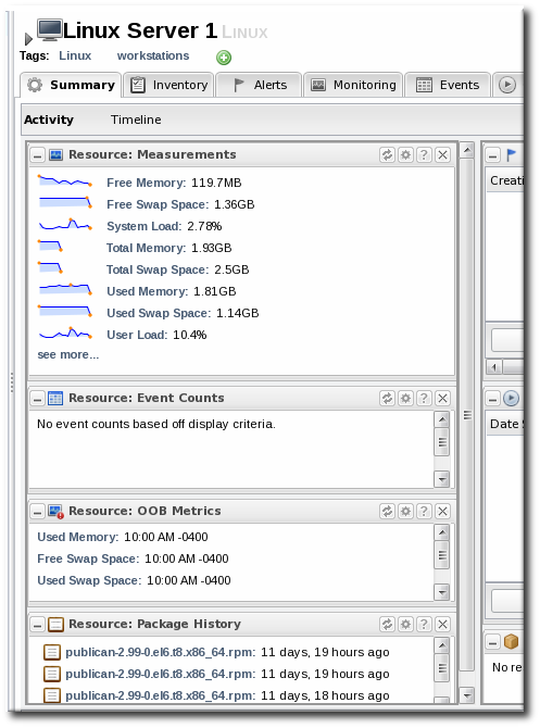
Figure 19. Resource Summary Tab
Click on any metric name in the Resource: Measurements portlet opens the metric graph. Clicking the see more... link opens the metrics charts in the Monitoring tab.
9.1.2. Main Dashboard
The Dashboard main page has a global view of all resources in the inventory. By default, this page shows only alerting data and unavailable resources. However, the Dashboard can be customized to show different portlets of monitoring data. Additionally, the main page can have multiple dashboards, so a dashboard can be created to look at different metrics for the same resource, the same metrics for different resources, or a combination of relevant metrics for a group of related resources — whatever you design.
The main dashboard has several types of portlets specifically for monitoring data:
- Platform Utilization, which shows free memory, CPU usage, and other metrics related to platform performance.
- Alerted or Unavailable Resources, which shows a list of the most recent five resources which have issued an alert or been reported as down
- A graph for a specific metric for a compatible group
- A graph for a specific metric for a resource
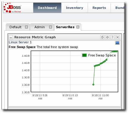
9.1.3. Adding Monitoring Metrics to the Main Dashboard
Charts for a specific metric for a resource can be added to the Dashboard. This makes it easier to see the current state of important readings for common or critical resources immediately, without having to configure alerts or check resource entries.
- Click the Inventory tab in the top menu.
- Select the resource type in the Resources menu table on the left, and then browse or search for the resource.

- In the resource hierarchy on the left, right-click the resource name.
- Scroll down to the menu item, select the metric from the list, and then select the dashboard to add the chart to.
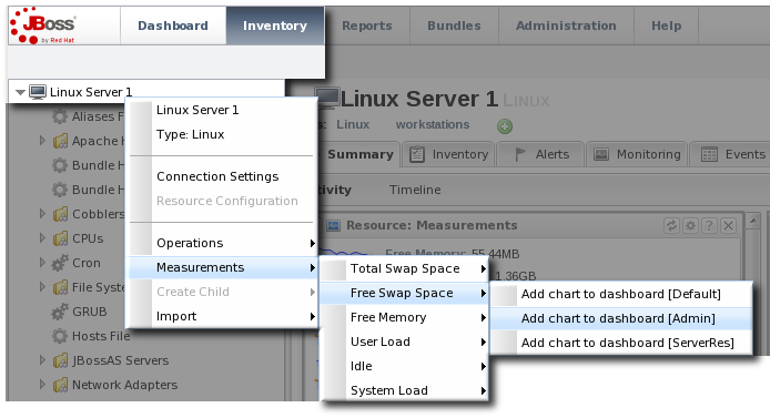
A chart for that specific metric on that specific resource is automatically added to the Dashboard that was selected.
9.2. Summary Timelines
The Timeline subtab in the Summary tab shows a line chart of all of the activity for the resource (with the exception of metrics collection, which is all under the Monitoring tab and charts). The Timeline aggregates all configuration changes, inventory changes, drift, events, content and bundle changes, operations, and alerts. Clicking any given point opens up the details for that specific action.
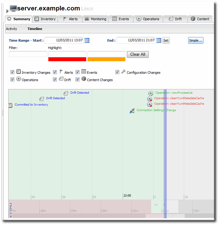
Figure 20. Summary Timeline
Because all information is on a single timeline, it becomes must easier to correlate incidents and events and to get a better understanding of the overall activity on that resource.
9.3. Resource-Level Metrics Charts
The Monitoring tab for a resource (or for a compatible group) has a series of different subtabs, each marking a different type of monitoring data. Each data group has its own monitoring charts.
- Section 4.2, “Viewing Metrics and Baseline Charts” for graphs and tables of the same metrics information
Most of the monitoring data is on the Graphs tab, which has a series of line graphs displaying the collected data for every metric for a resource. These same data are repeated on the Tables tab, only laid out in a text-based table rather than visually.
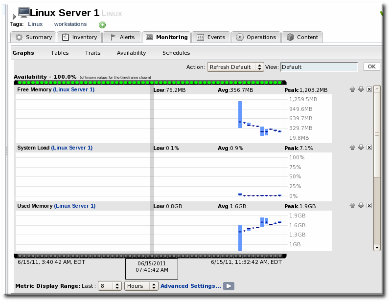
Figure 21. Metrics Chart
9.4. Creating Custom Metrics Pages
Much like creating a custom dashboard, it is possible to create a custom monitoring page for resources, so that the specific metrics displayed and the display order are different.
- Open the Monitoring > Charts page.
- In the Action drop-down menu, select Create New View.

- Enter a name in the View field, and click .
- To switch to a view, open the Action drop-down menu, and select the view name.
- Use the arrows by the different metrics charts to change the order the metrics are displayed. To remove a metric from the view, click the X box.
9.5. Suspect Metrics Report
As described in Section 4.1.1, “Baselines and Out-of-Bounds Metrics”, once metrics have been collected a few times, JBoss ON begins calculating a normal operating range for that specific resource and that specific metric. This creates a range based on the lowest and highest values.

If a metric data point comes in that is outside that normal range, higher or lower, that is a suspect metric. It could be a fault of the metric collection or it could indicate a resource problem.
Each individual resource has a portlet on its Summary tab which lists suspect, or out-of-bounds, metrics.
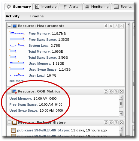
Figure 22. Out of Bounds Portlet
All resources, across the inventory, which have a suspect metric are listed in the Suspect Metrics report with the metric, its normal range, its suspect reading, and the factor or percentage of how far outside the metric is from normal readings.
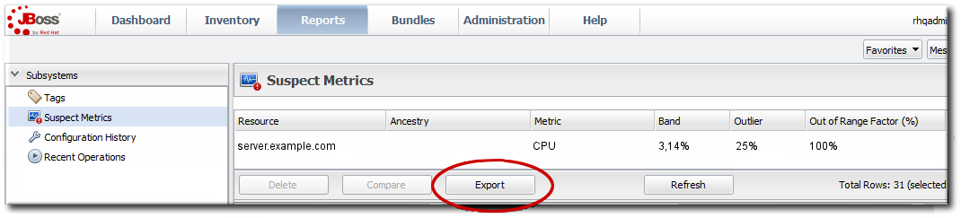
Figure 23. Suspect Metrics Reports
Note
Reports can be exported to CSV, which can be used for office systems or further data manipulation.
To export a report, simply click the button. The report will automatically be downloaded as
suspectMetrics.csv.
9.6. Platform Utilization Report
For general infrastructure monitoring, the primary resource is the platform. The Platform Utilization report shows a very quick snapshot on the health of every platform in the inventory by showing its current system performance, in three metrics:
- Current CPU percentage
- The actual memory usage, based on the available physical memory, buffer, and cache
- Swap
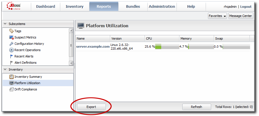
Figure 24. Platform Utilization Report
Note
This report can also be added to the main Dashboard or a resource-level Summary dashboard as a portlet.
There are a couple of caveats. Only available platforms are listed. Other platforms in the inventory that are not in an available state are not listed. Also, the utilization is based on the most recent live data, not averages or historical values. It provides an immediate look at the platform resources.
Note
Reports can be exported to CSV, which can be used for office systems or further data manipulation.
To export a report, simply click the button. The report will automatically be downloaded as
platformUtilization.csv.